Accessible Beige. Agreeable Gray. Repose Gray. Antique White. These are not descriptive colors — they are brand names for feelings the paint company wants you to associate with their product. The dirty little secret of the paint industry is that color names are almost entirely marketing, designed to evoke mood rather than describe what is actually in the can. The good news: once you know how paint actually works, you will never waste $80 on a gallon you hate again. Here is how the system really works.
1. Paint Names Are Deliberately Vague — On Purpose
What is actually happening: Paint companies name colors to sell an aspirational feeling, not to describe the pigment. “Accessible Beige” (Sherwin-Williams), “Agreeable Gray” (Sherwin-Williams), and “Repose Gray” (Sherwin-Williams) are all, functionally, beige. They are warm, neutral, grayish-beige tones that read differently depending on your light — but they are in the same color family.
Real example: A homeowner picks “Agreeable Gray” from a tiny chip at the store because the name sounds neutral and sophisticated. On their walls, it reads warm beige — not gray at all. They wanted gray. They got beige. The name was the problem: it set an expectation the color did not meet.
What to do: Stop reading the name. Start reading the color code and the LRV (more on that next). The name is for marketing; the numbers are for decision-making.
2. The Number That Actually Matters: LRV
What it is: LRV stands for Light Reflectance Value — a number from 0 (pure black, absorbs all light) to 100 (pure white, reflects all light). Every paint color has an LRV, and it tells you how light or dark a color will read on your walls far more accurately than the name or chip.
Real example: Two “whites” — one with an LRV of 85 and one with an LRV of 92 — will look dramatically different on a wall. The 92 will feel bright and airy. The 85 will feel warmer and more substantial. Same category, very different rooms.
What to do: For small or dark rooms, aim for LRV 75+. For rooms where you want warmth and coziness rather than brightness, 55–70 range. For a dramatic accent wall, go below 30. Most paint brands list the LRV on their website under each color — look it up before you buy.
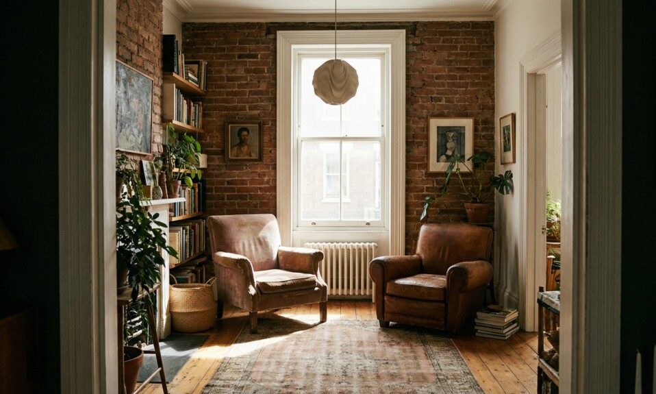
3. Undertones: Why the Same “White” Looks Wrong in Your Room
What it means: Every paint color has an undertone — a subtle secondary color that becomes visible under certain lighting conditions or against certain other colors. Whites can have pink, yellow, green, blue, or purple undertones. Grays can be warm (beige-leaning) or cool (blue/green-leaning). This is why a white that looks perfect in one room can look vaguely off in another.
Real example: A homeowner chooses a crisp white for their kitchen. Against their cool-toned stainless steel appliances and blue-gray tile, the white looks slightly yellow. Why? The white has a warm yellow undertone that clashes with the cool surroundings. Swap it for a white with a cool or neutral undertone and the room suddenly coheres.
What to do: Hold your chip against the fixed elements in the room — flooring, cabinetry, countertops — not against other paint chips. The undertone conflict will reveal itself immediately. Warm undertones work with warm materials (wood, cream tile, brass fixtures). Cool undertones work with cool materials (white marble, chrome, concrete).
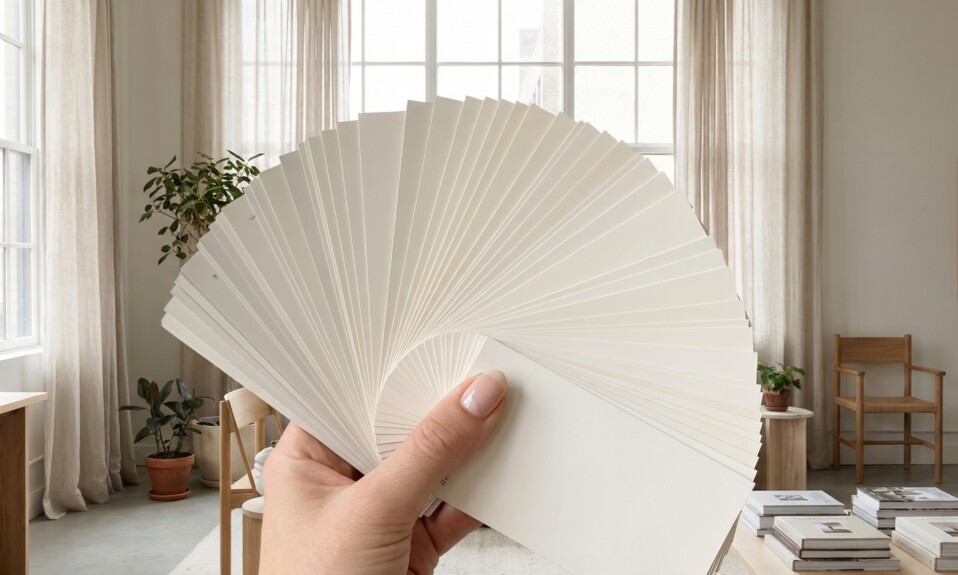
4. The Sample Pot Problem (and Why You Must Use One)
What is happening: The paint chip at the store is 2 inches wide, lit by fluorescent lighting, surrounded by dozens of other colors, and printed on paper — not painted on drywall. It is approximately the worst possible way to evaluate what a color will look like in your home. Yet most people choose their paint color entirely from chips. For a different but related slice of the same world, 25 Things Experienced International Travelers Always Pack That Most People Never is a good next stop.
Real example: A homeowner loved a deep teal-green on the chip. On a 12-inch swatch on the wall, the same color read almost black in their north-facing room. The chip showed the color in ideal lighting. The wall showed the color in their actual room. These are different things.
What to do: Always buy sample pots ($4–$8 each) and paint a large swatch — at least 12×12 inches, ideally bigger — directly on the wall you are painting. Live with it for 24–48 hours and observe it at different times of day and under your artificial lighting. This step alone prevents probably 80% of “I hate it” moments.
5. The 60-30-10 Color Rule
What it is: A classic interior design principle for distributing color in a room. 60% is your dominant color (typically walls), 30% is your secondary color (large furniture, rugs), and 10% is your accent color (pillows, art, accessories). The ratio creates visual balance without monotony.
Real example: A living room with 60% warm white walls, 30% navy blue sofa and area rug, and 10% brass and terracotta accents feels intentional and complete. A room where the walls are a bold color AND the sofa is bold AND the rug is patterned feels chaotic — too many things competing for attention. Readers who enjoy these kinds of details may also want 25 Things Hotel Staff Notice About You the Moment You Walk Through the Door in 2 for another quick detour.
What to do: Decide which color you want to be your 60% before you paint. If you want your sofa or rug to be the statement piece, paint the walls neutral. If you want the walls to be the statement, pull back on the furniture. You cannot have the statement everywhere.
6. How Lighting Changes Everything (North vs. South-Facing Rooms)
What is happening: Natural light is not the same throughout your home. North-facing rooms get cool, indirect light all day — colors read truer and cooler, and dark colors go very dark, while warm colors can look muddy. South-facing rooms get warm, consistent light — almost anything looks good. East-facing rooms get warm morning light, cool afternoon light. West-facing rooms are the opposite. For another nearby rabbit hole, What ‘Free Cancellation’ Actually Means — And When It Doesn’t Apply looks at a related piece of everyday culture.
Real example: The same gray paint looks crisp and sophisticated in a bright south-facing bedroom and dingy, cold, and slightly green in a north-facing hallway. Same can. Completely different result.
What to do: For north-facing rooms, lean warmer and lighter than you think you need to. For west-facing rooms, be cautious about warm tones — they will go very orange/yellow in afternoon sun. Test your sample swatch at the specific time of day you use that room most.
7. Artificial Lighting Matters as Much as Natural
What is happening: The color temperature of your light bulbs dramatically affects how paint reads. Warm bulbs (2700K) make warm paint colors sing and cool colors look flat or dull. Cool/daylight bulbs (5000K+) do the opposite — they pop cool blues and grays, and make warm tones look washed out or slightly sickly.
Real example: A homeowner paints their bathroom a beautiful cool blue-gray. Under their warm Edison bulbs, it looks brownish and undefined. Switch to a daylight bulb and suddenly the blue-gray is crisp and elegant. The paint did not change. The light did. If you like this kind of overlooked detail, What Did ‘Groovy’ Actually Mean? The Real History is another useful read to open next.
What to do: Note what kind of bulbs you have in each room and observe your sample swatch under those specific bulbs in the evening, not just in natural light. If you are committed to warm bulbs, choose warm-toned paint. If you use cool or daylight bulbs, you have more freedom with cool colors.
8. What to Actually Ask at the Paint Store
The questions that get you somewhere: Most paint store staff know a lot more than the average homeowner — but only if you ask specific questions. “What looks nice” is not a useful question. Here are ones that are.
Ask: “What is the LRV on this color?” Ask: “Is this a warm or cool undertone?” Ask: “I have a north-facing room — what would you steer me away from?” Ask: “What finish should I use for a bathroom vs. a bedroom vs. trim?” (Finish matters: flat/matte hides imperfections but is not washable; eggshell is practical for most rooms; semi-gloss is for trim and moisture-prone areas.) That same curiosity is what makes 90s Phrases We All Said But Never Actually Questioned worth checking after this section.
What to do: Bring a photo of your room on your phone, including the flooring, existing furniture, and any fixed elements you are keeping. The more context you give the staff, the more useful their advice. And always, always buy the sample pot first.
Paint color is not a mystery — it just has its own language that the industry never bothered to teach you. LRV, undertones, light temperature, and the 60-30-10 rule are the four concepts that separate homeowners who love their walls from homeowners who repaint the same room three times. You are now in the first group. Go get those sample pots. If this part caught your attention, Words Your Parents Used That Gen Z Has Never Heard gives you another specific angle to compare.